Words that sprung into our PMG designer’s minds on the announcement: bold, romantic, brave, promiscuous, vibrant, optimistic, audacious, trusting, vivid, intense and powerful.
The era of vibrancy is clearly upon us, rounding out a year of blush-tone selections.
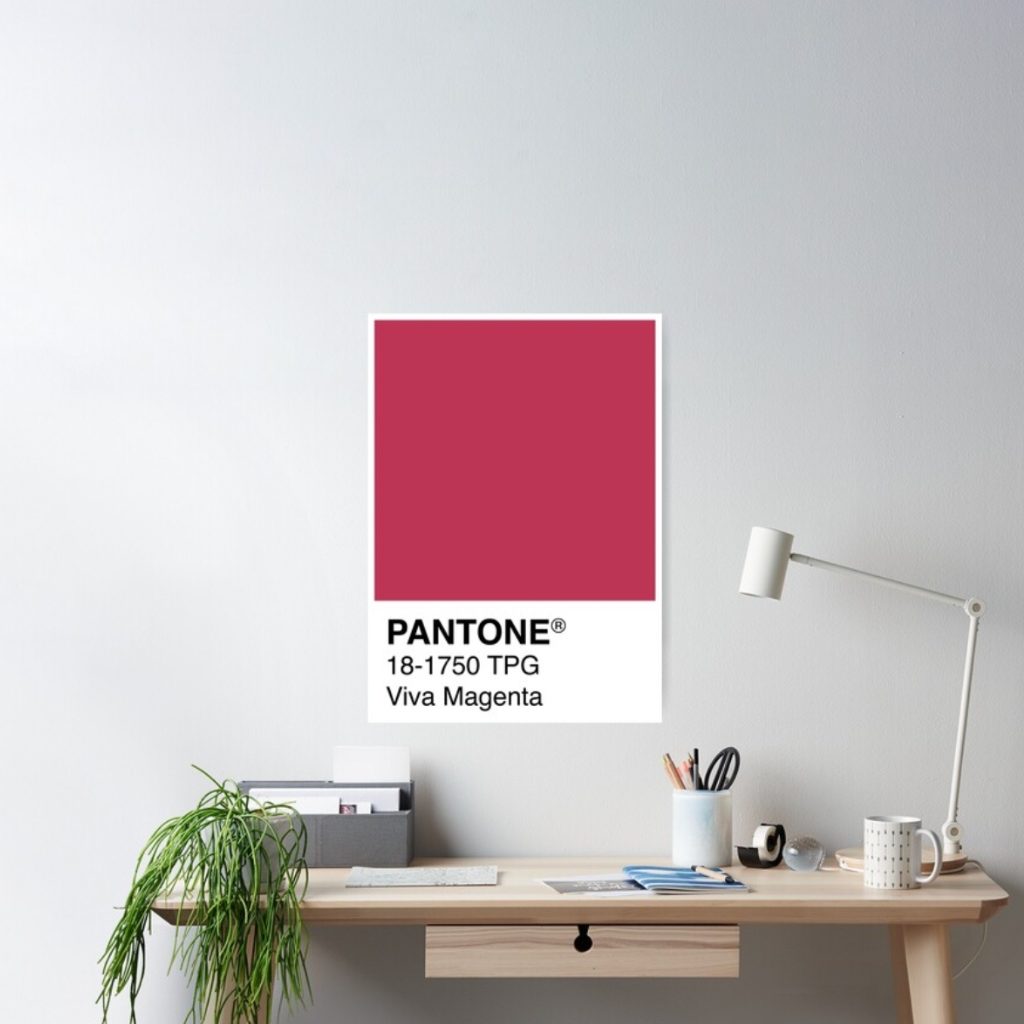
Pantone has revealed its highly anticipated colour of the year for 2023: a bold shade of red that is expressive and powerful, and non-surprisingly, we have seen it before.
“It is a new animated red that revels in pure joy, encouraging experimentation and self-expression without restraint, an electrifying, and a boundaryless shade that is manifesting as a stand-out statement”, describes Leatrice Eiseman, Executive Director of the Pantone Color Institute.
Viva Magenta has been around for more than 150 years! After the 2020s muted pebble followed by the 2021 bright periwinkle, the vibrant red is ready to take over.
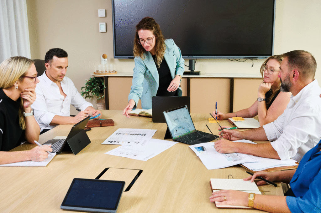
But what does this mean for a workplace? Assertive but not aggressive, it is a daunting colour to incorporate. The colour is designed to draw inspiration, so naturally, as designers, this is a colour we want to include in workspaces as we move into a new year filled with inspiration, ideas and energy.
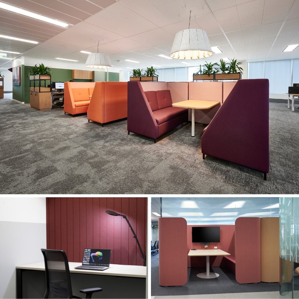
One easy, quick way to integrate the colour of the year into your workplace is through soft yet statement-making furnishings that can insert trends into an area. Utilise the red-meets-pink and keep the rest of the room neutral.
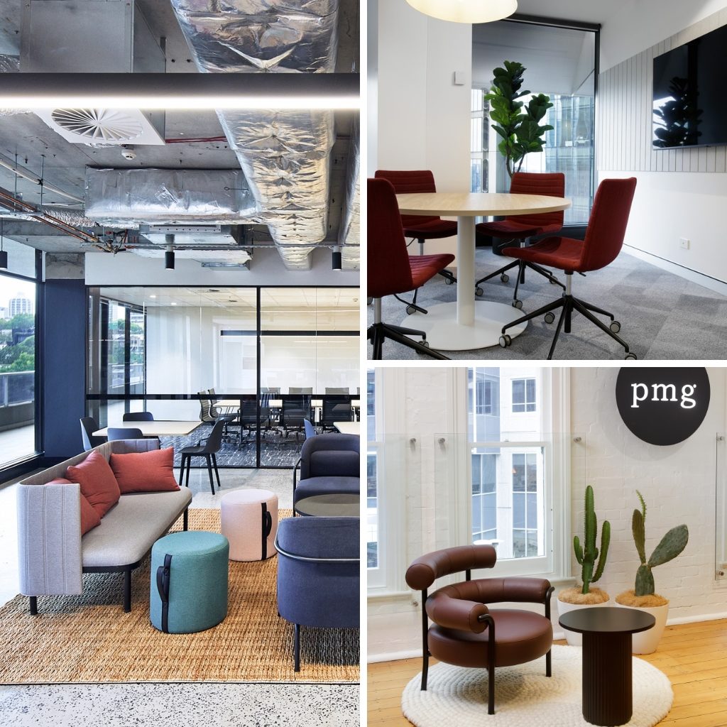
Another way to permanently introduce Viva Magenta into your workspace is through meeting pods or breakout spaces set to generate big ideas. Not only do meeting pods already encourage collaboration and are great for neurodivergent employees, the colour “reconnects us to the original matter. Invoking the forces of nature, PANTONE 18-1750 Viva Magenta galvanised our spirit, helping us to build our inner strength.”
Discover more with PMG.